Brand system
2026
Orbit Pay
A payments app that feels calm about your money.
A brand system, 3D illustration kit and website for a Series A fintech.
The brief
A Series A fintech that looked like every other blue bank app, in a market where trust is the whole product.
What we made
Brand system, a 3D illustration kit, an app UI refresh and a new marketing site.
Services
Brand system · Illustration · Website · App UI
What changed
sign-ups from the new landing page
illustrations in the kit
from first call to launch
How we did it
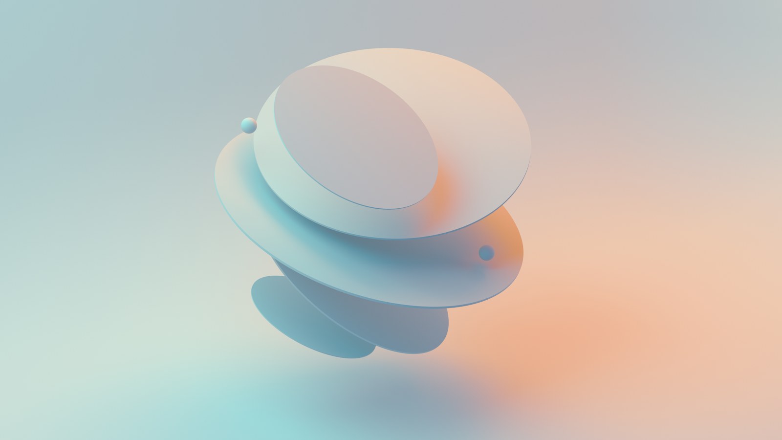
Money apps shout. We wanted Orbit to feel like a quiet room: soft shapes that float, colours that never go red unless something is actually wrong.
The illustration kit is 180 3D pieces built on one lighting setup, so product, marketing and support can make new scenes without us.


In their words
Our support tickets got calmer. People read the new app as safer, and we didn't change a feature.
Priya Nand, CPO

Keep going
More from the line.
Three more case studies, each with its own brief and numbers.


Want results like these?
Tell us what you’re launching and when. We’ll reply within a working day with a fixed price and a calendar.